CS 132
CSS II
Redundancy Review
Which of the following is better?
#id1 {
    font-size: 16pt;
    color: black;
}

#id2 {
    font-size: 16pt;
    color: red;
}
#id1, #id2 {
    font-size: 16pt;
}

#id1 {
    color: black;
}

#id2 {
    color: red;
}
The second is better; even though there are more rulesets, the properties are factored out to reduce redundancy so we can limit how many rules we need to change (particularly helpful for updating thematic styles like colors and fonts)
Overview of Layout Techniques in CSS
- Appropriate use of Block vs. Inline elements and nesting in HTML
- Box Model (margin/padding/border)
- Flex
- Positioning
- Float (less common today, but still good to know)
These are what we expect you to focus on, roughly in order of prioritization
Ways to group content with HTML:
These are descriptive content groups (block level). It's less likely that you'd need to pair these with a class.
<header>,<main>,<footer><section>,<article><nav>,<aside>
Also, there are two general
content grouping tags. These are the ones that you probably need to pair with a
class or id, though not always.
<div>-- block level<span>-- inline level
How can we use CSS to get a page layout like above?
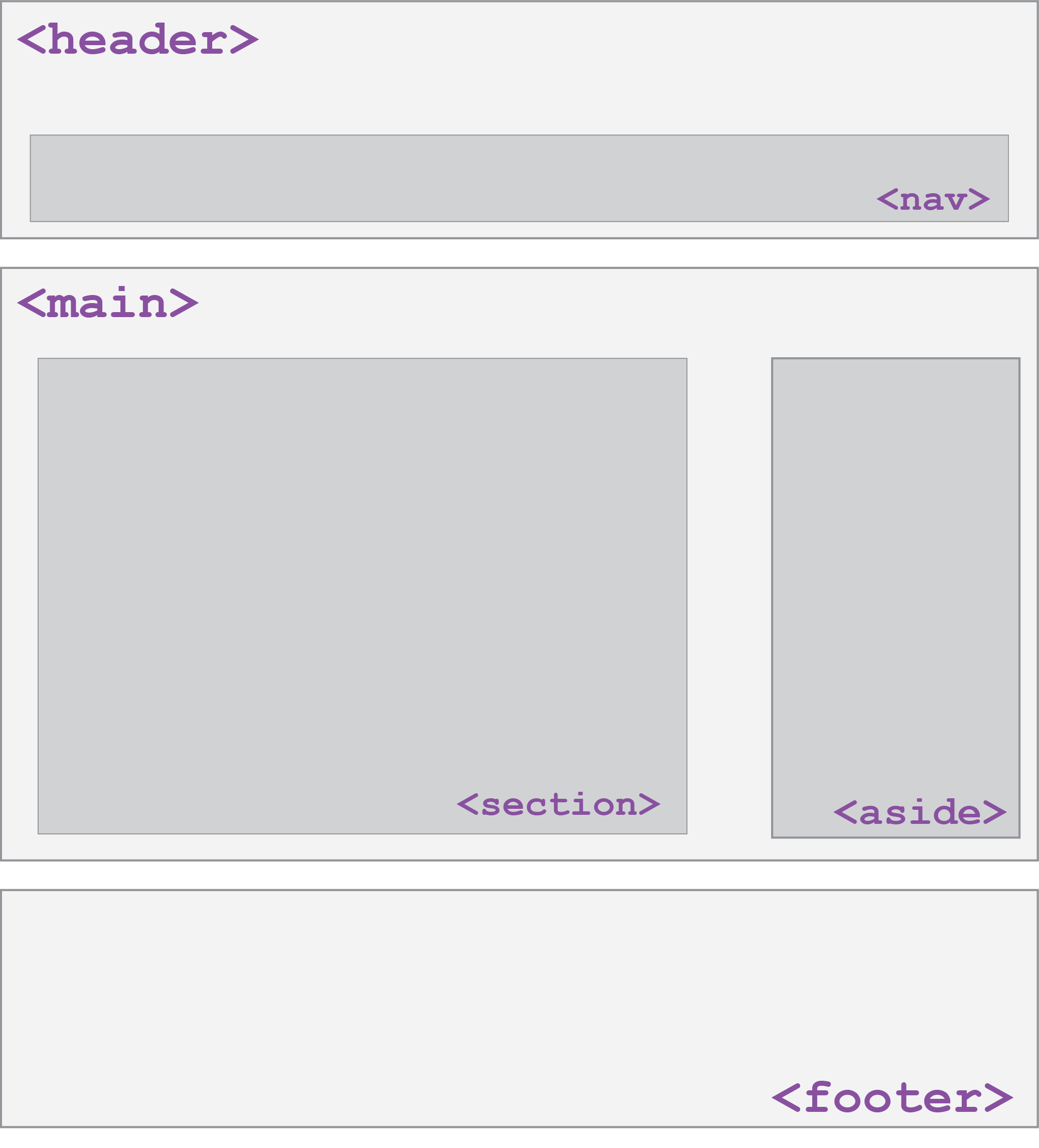
Example Page Layout
Default Dimensions of Block and Inline Elements
- Height
- Block and inline elements normally have the height of their content
- Width
- Inline elements have the width of their content
- Block elements have a width that spans the width of their parent
<p id="css">
  CSS is <strong>really</strong> great!
</p>

<p id="html">HTML5 is pretty cool too.<p>
HTML
#css { background-color: lightblue; }

#html { background-color: lightgreen; }

strong { background-color: white; }
CSS
CSS is really great!
HTML5 is pretty cool too.
Setting width and height (block only)
<p id="css">
  CSS is <strong>really</strong> great!
</p>

<p id="html">HTML5 is pretty cool too.<p>
HTML
#css {
  width: 80%;
  height: 60px;
}

strong {
  width: 120px; /* this doesn't work */
  height: 50px; /* this doesn't work */
}
CSS
CSS is really great!
HTML5 is pretty cool too.
output
Inline-Block Elements
Inline elements have width/height that is defined based on their content.
Cannot set width/height (or vertical margin) of inline elements, but can change
them to inline-block elements using the display property.
<p>
  CSS is <strong>really</strong> great!
</p>

<p>HTML5 is pretty cool too.<p>
HTML
#css {
  width: 80%;
  height: 60px;
}

strong {
  /* We still get the inline display,
     but with width/height */
  display: inline-block;
  width: 120px; /* works! */
  height: 50px; /* works! */
}
CSS
CSS is really great!
HTML5 is pretty cool too.
output
Note that images are inline-block by default, so keep this in mind!
More about Width and Height
Both can be set using length units (px, % are most common - when doing page layout, generally want to do % unless you know you have elements that are a fixed width)
- Note: Usually
widthdefines the dimensions sufficiently, so settingheightisn't very comment for images or text elements.
Can specify the min-width, max-width, min-height, or max-height properties, which are particularly
useful for responsive design (more examples).
The Box Model: (Inspect me!)
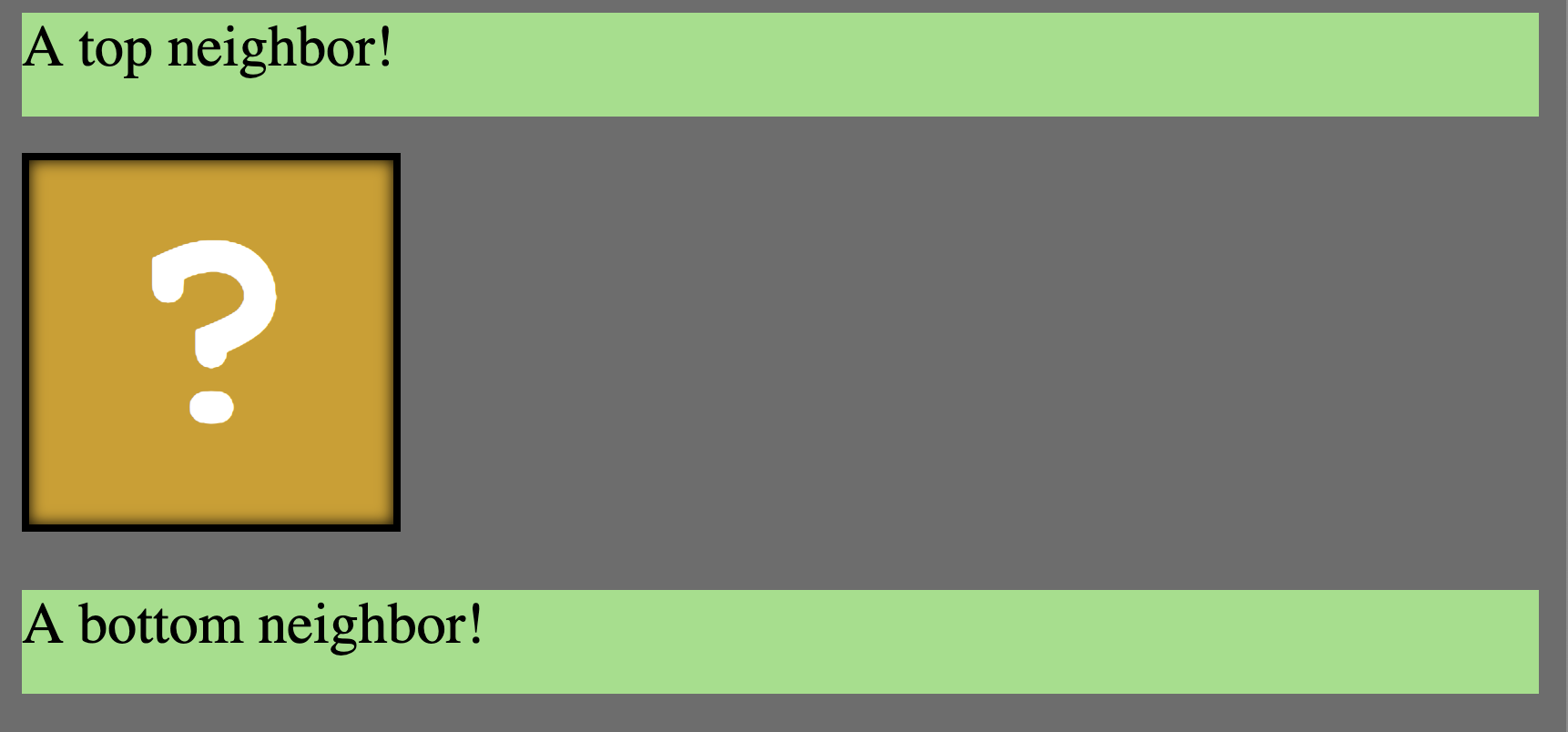
Wait, what?
- margin
- (outside) space between different elements
- border
- (optionally visible) line that separates elements
- padding
- (inside) space between element content and border
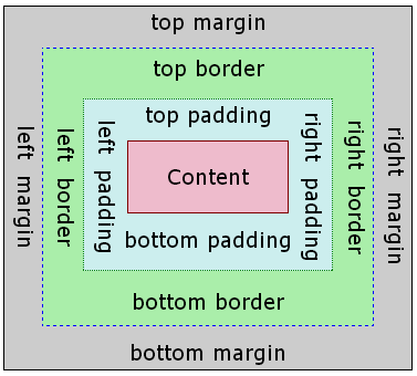
You can also see this model for each element in the Chrome inspector
CSS Properties for Borders
h4 { border: 5px solid red; }
CSS
This is a heading.
output
| Property | Description |
|---|---|
border
|
thickness/style/color of border on all 4 sides |
Thickness (specified in px, pt, em, or
thin, medium,
thick)
Style
(none,
hidden,
dotted,
dashed,
double,
groove,
inset,
outset,
ridge,
solid)
Color (specified as seen previously for text and background colors)
Tip: Use the Chrome Inspector to check out different styles!
More Border Properties
| Property | Description |
|---|---|
border-color,
border-width,
border-style
|
specific properties of border on all 4 sides |
border-bottom,
border-left,
border-right,
border-top
|
all properties of border on a particular side |
border-bottom-color,
border-bottom-style, border-bottom-width,
border-left-color, border-left-style,
border-left-width, border-right-color,
border-right-style, border-right-width,
border-top-color, border-top-style,
border-top-width
|
properties of border on a particular side |
Rounded corners with
border-radius
p {
  border: 3px solid lightsalmon;
  border-radius: 12px;
  padding: 0.5em;
}
CSS
This is a paragraph.
This is another paragraph.
It spans multiple lines.
output
Each side's border radius can be set individually, separated by spaces
Can set to 50% to get a full circle border (try it in the inspector!)
CSS Properties for Margins
Specified in px, pt, em, rem,
%
| Property | Description |
|---|---|
margin
|
margin on all 4 sides |
margin-bottom
|
margin on bottom side only |
margin-left
|
margin on left side only |
margin-right
|
margin on right side only |
margin-top
|
margin on top side only |
Shorthand for Margin/Padding

CSS Properties for Padding
Again, prefer px, pt, em, rem,
or % for units
| Property | Description |
|---|---|
padding
|
padding on all 4 sides |
padding-bottom
|
padding on bottom side only |
padding-left
|
padding on left side only |
padding-right
|
padding on right side only |
padding-top
|
padding on top side only |
Alignment
How do we align text? How about block elements (e.g. page sections)?
Horizontal and Vertical Alignment
-
text-align: (center | left | right | justify) - Align inline elements horizontally inside a parent container
-
vertical-align: (baseline | text-top | text-bottom | sub | super) - Align inline or inline-block (e.g. image) elements vertically relative to the text
Text and Image Alignment Examples
<div id="cup-container">
  <p>
    Some text!
    <img id="cup1" src="coffee-ascii.png" alt="...">
    <img id="cup2" src="coffee-ascii.png" alt="...">
  </p>
</div>
HTML
#cup-container { text-align: right; }

#cup1 { vertical-align: middle; }

#cup2 { vertical-align: text-top; }
CSS
This is some text!

output
Vertical align can be tricky - usually use when centering images alongside text but can use flex layout (soon) to make centering a lot easier.
There are some good use cases though, and you can find a great read here.
But what about Alignment for Block Elements?
Centering Page Elements: An Attempt
<body>
  <div id="box"></div>
</body>
HTML
body {
  /* Doesn't work on block elements! */
  text-align: center;
}

#box {
  background-color: orange;
  height: 200px;
  width: 200px;
}
CSS
output
Inspect this page and use margin-right: auto; and margin-left: auto; on the block to center.
Centering Page Elements: A Solution
<body>
  <div id="box"></div>
</body>
HTML
#box {
  background-color: orange;
  height: 100px;
  width: 100px;
  margin-left: auto;
  margin-right: auto;
}
CSS
output
This margin approach "fills in" the left and right margins of the block based on the width (which must be defined!)
Summary of Box Model
Everything is a box.
Boxes can be block or inline
Boxes have content, padding, border, and margin
It can be a bit tricky to layout boxes next to each other, but the DOM tree and the Chrome Inspector are very useful development strategies!
Summary of Centering
text-align-- apply to a parent container to align the inline content within
vertical-align-- apply to inline items (usually those with a height, like an image)
to vertically align them relative to other inline elements nearby
margin-left: auto;, margin-right: auto;-- use auto margins and a
width to center a block element in its parent
Soon, we'll learn flex layout - this can often be used instead of setting the margin (and also makes vertical alignment much easier)
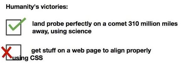
We Can Now Appreciate This...

Source: reddit.com/r/ProgrammerHumor
Moral of the story: CSS has a notorious reputation (mostly pre-flex), but it is important and you bring a lot of value to a full-stack team if you can figure out responsive layout (with good practices).
More CSS Layout
Practice different layout strategies
- ... with boxes
- ... using flex for a responsive "coffee shop" page layout (continued Tuesday)
Why Page Layout is Important
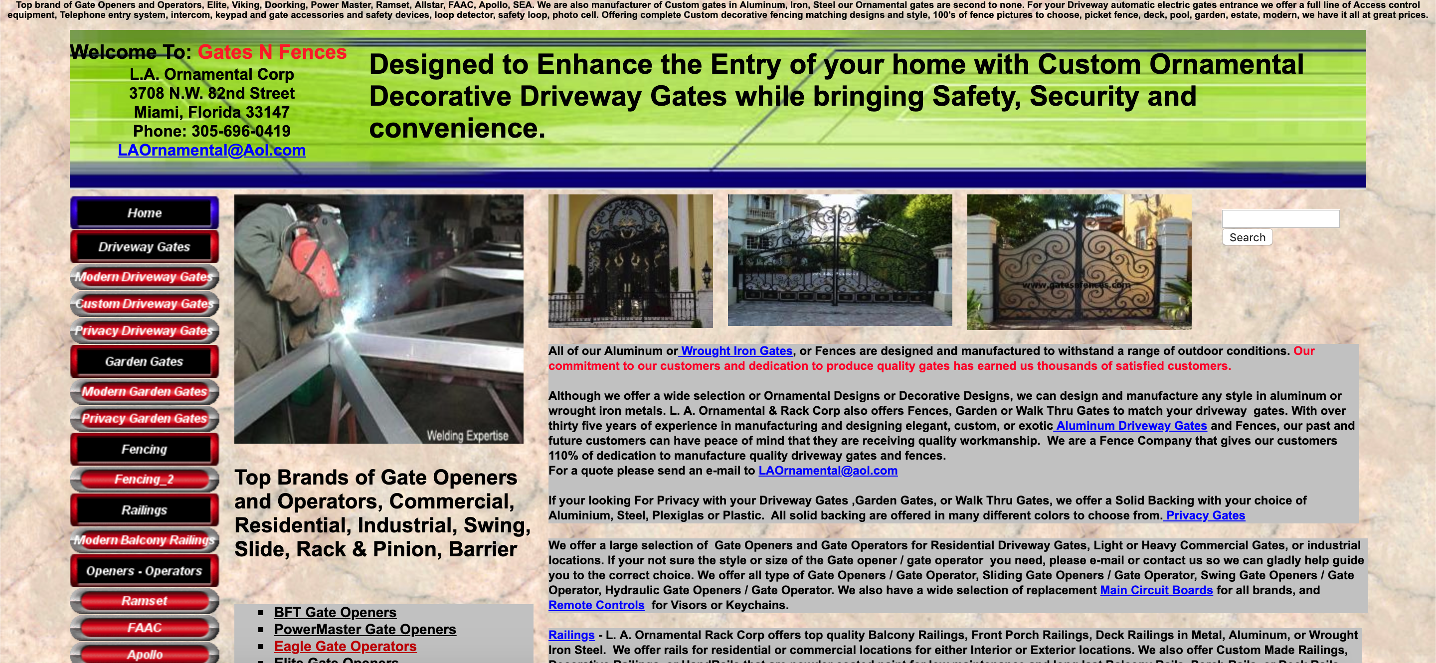
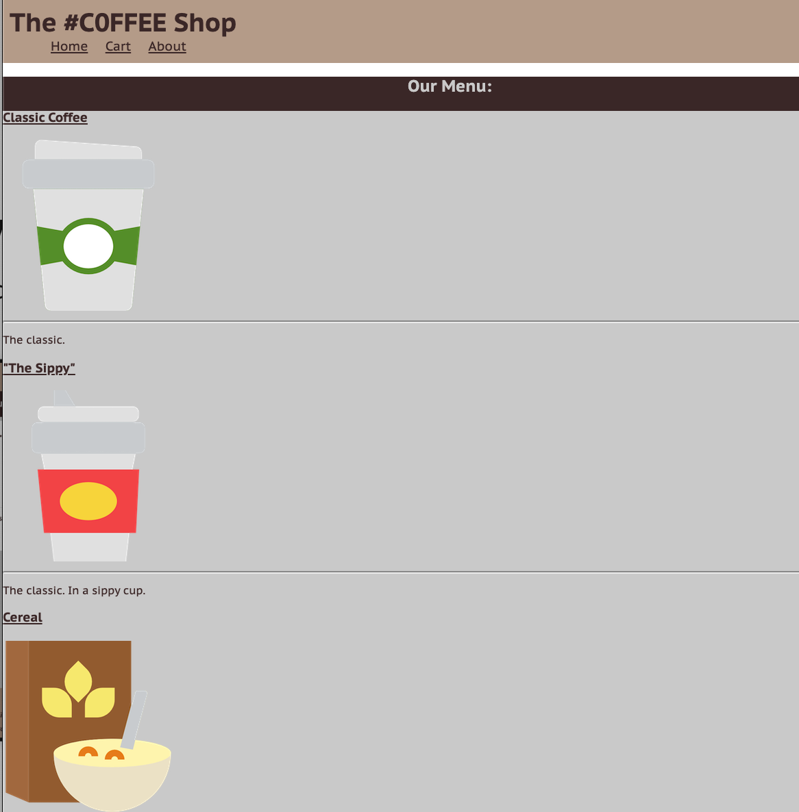
An example of poor HTML tags, layout, and accessibility (try resizing the page). The "old days" of layout. I tried a screenreader. It froze.
More Motivating?
This is the official HealthCare.gov webpage in 2018, where all kinds of users rely on for health care information.
Some visually-impaired users need larger font sizes on the screen.
What happens to the search bar when you increase the font size?
As a client, have you ever left a website (that may be useful) because of the layout or accessibility?
There's a lot of very cool research on verifying page layout!
The Goal: Clean Layout, Responsive Design.
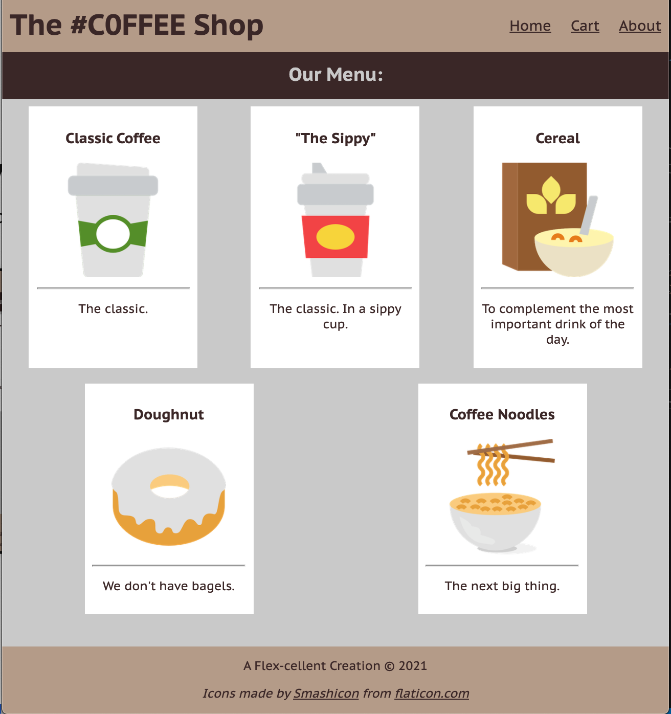
Today, we'll learn the fundamentals of various layout techniques to go from something like this...
Starting with Building Blocks
Question: What does this look like on a webpage by default?
<div id="container">
  <div>0</div>
  <div>1</div>
  <div>2</div>
  <div>3</div>
  <div>4</div>
  <div>5</div>
</div>
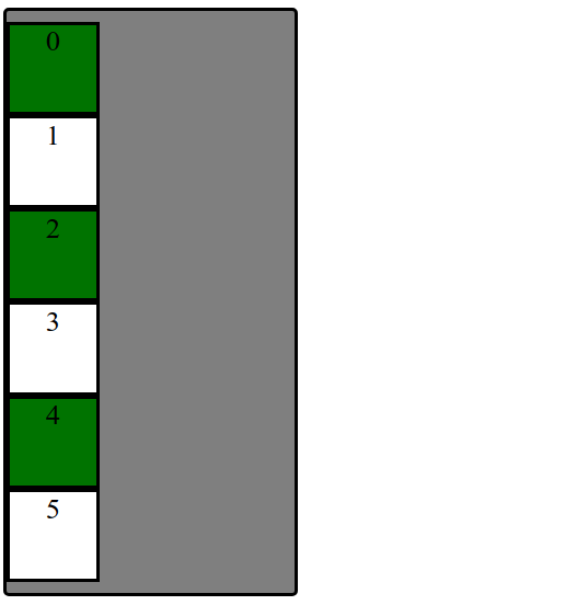
We'll have some basic CSS already implemented to focus on layout practice today.
Uh... Why are we playing with boxes?
When learning CSS layout, you'll find there are many ways to layout your pages.
"Boxes" are great to practice with for comparing different layout strategies and better understanding the box model.
We are also working with text inside of each div to demonstrate block vs. inline layout.
In practice, it's useful to:
- Treat page elements as boxed regions to figure out the page layout
- Then focus on more specific CSS styling
(Older) Layout Method: Floating Elements
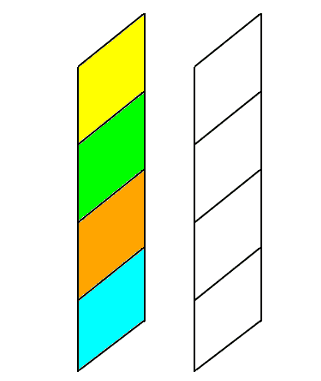
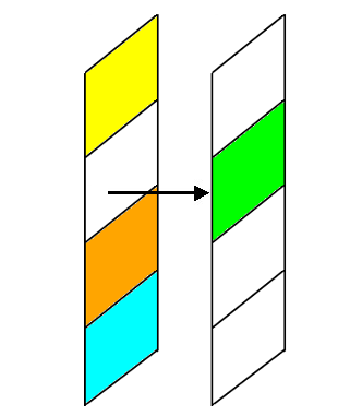
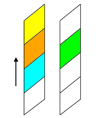
A way to remove elements from the normal document element flow, usually to get other elements to "wrap" around them.
Can float left, right (no center)
An Analogy: Page Layers as Sheets of Paper
Example Without Float
The blue block is a non-floating (regular) block element (a div). It's only 100px wide, but
since it's a block element, the browser positions it on its own line (spanning the width
of the page)
See the Pen Box - Float by El Hovik (@mehovik) on CodePen.
Example with Float
Now the blue block has the float CSS property set to left. This tells the browser
to give the element as much space as it needs, and then start bringing the next content up from below
and fill in remaining space.
See the Pen Box - Float by El Hovik (@mehovik) on CodePen.
Add overflow: auto; to make a parent of a floating element contain the floated element.
Add clear: both; to make a subsequent block element (e.g. p) start a new block line.
Exercise: Breaking the Block Layout

Make boxes into a row instead of a column
One possible solution: "Float" the boxes left or right.
Another solution: Set display: inline;
What happens when we just add float: left?
Hint: Use overflow: auto to ensure container adjusts height if
contents "overflow" outside of the borders.
Back to Boxes...
Extra Practice: Center the box container on the page and change width to 75%.

Can we float? Unfortunately, can't center float element cleanly.
Idea: Use the fact that the container is block by default and spans width of the page. But if the container is 75% of the page width... where does that extra spacing come from?
For block elements that have a specified width, you can center
them by setting left and right margins to auto.
Distributing Boxes Evenly in a Container
How could we distribute boxes across box container evenly (equal space between each box)?.

... what should we do about the margins of the boxes?
display Property
The display property specifies the display behavior (the type of rendering box) of an element. The four values you most often will see are:
inline: Displays an element as an inline element, spanning the width/height of its content. Any height and width properties will have no effect.block: Displays an element as a block element. It starts on a new line, and takes up the width of the parent container.none: The element is completely removed.flex: Displays an element as a block-level flex container.
Flexbox: A Magical, Wonderful, Thing
Flexbox layout is a set of CSS properties for aligning block level content.
Flexbox defines two types of content - "containers" and "items" (or "parents" and "children").
Anything directly nested inside of a flex container becomes a flex item.
Various properties on the container can be set to determine how its items are laid out.
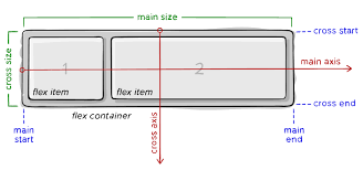
Image Source and useful flexbox guide
The Most Common Flex Properties
- Define a parent with
display: flex; - Is it a row or column?
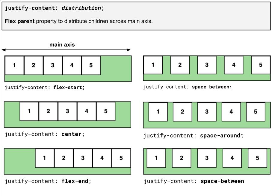
flex-direction(defaultrow) - How do you want its children to be distributed across the main axis?
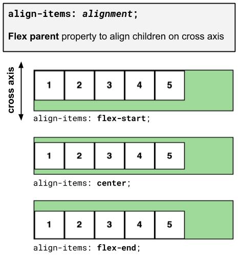
justify-content - How do you want the children to be aligned on the cross axis?
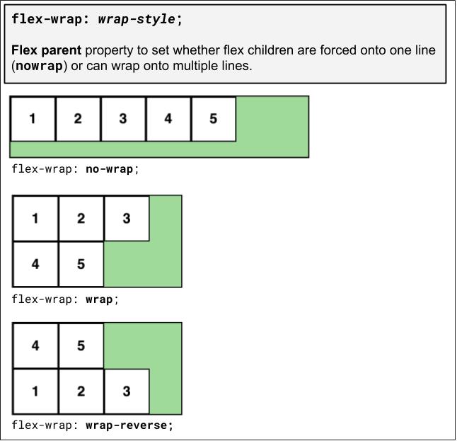
align-items - Do you want elements to wrap if the parent gets too small?
flex-wrap
flex-direction
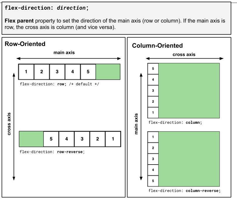
Tip: Practice with this page and the Chrome Inspector using the next few slides.
justify-content
align-items
flex-wrap
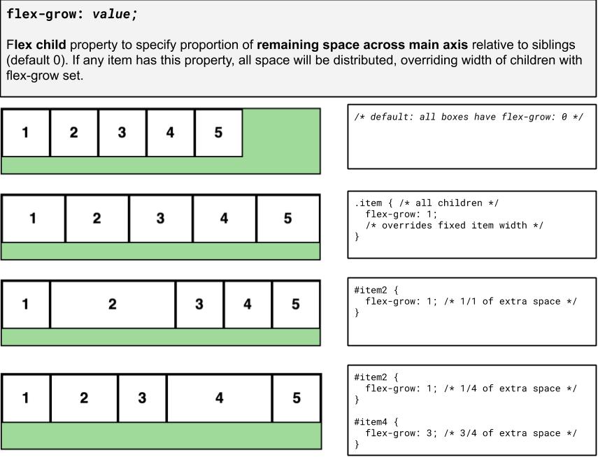
flex-grow
Basic properties for the flex container
display: flex;- makes an element a "flex container", items inside automatically become "items" - by default, starts as a row
justify-content: flex-end; (flex-start, space-around,...)- indicates how to space the items inside the container along the main axis
align-items: flex-end; (flex-start, center, baseline,...)- indicates how to space the items inside the container along the cross axis
flex-direction: row; (column)- indicates whether the container flows horizontally or vertically (default row)
flex-wrap: wrap; (no-wrap, ...)- indicates whether the container's children should wrap on new lines
Basic properties for the flex items
It is less common to add flex properties to flex items, but on occasion you will need to.
flex-grow: <number>- Defines a proportional value to determine whether a flex items can grow (what amount of the available space inside the container it should take up).
flex-basis: 20%; (3em, 50px,...)- indicates the default size of an element before the extra space is distributed among the items
align-self: flex-end; (flex-start, center, stretch,...)- indicates where to place this specific item along the cross axis
Back to our Boxes
Exercise: Distribute boxes across box container evenly (equal space between each box).

Exercise: Responsive Page Layout - Wrapping
Set boxes to wrap when box container gets too small in the browser so that they keep their square widths (what happens when you shrink the browser width in the previous exercise?).
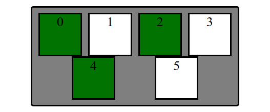
Extra Practice: A bunch more fancy flex stuff
Layout boxes into two 3-box columns using flex (use screenshot with given details). Note: don't rely too much on previous CSS solutions - you'll need to change the HTML slightly as well to get the columns grouped)
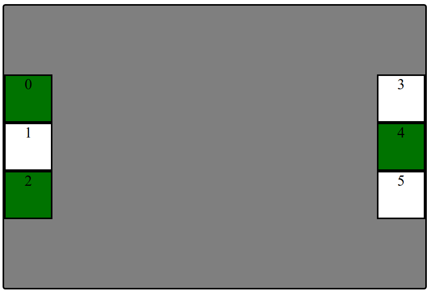
- In the HTML, make boxes grouped in two 3-box columns (hint: add a class to both groupings called "column").
- Change height of
#containerto 500px and center the columns vertically - Distribute the two columns on both left/ends of the
#container.
Summary of Flex Layout
Flex is a powerful way to create responsive page layouts
Really takes practice, but remember to use wireframes and the DOM!
Making an element a flex parent will unlock various flex properties to distribute across an axis and align down that axis.
The DOM tree is useful to focus only on the parent/children containers
Common bugs:
- Setting
display: flexon children instead of parent: Remember, the parent tells the children what to do! (with occasional cases of flex children properties likeflex-grow) - Making everything a flex container - use flex only when you want control over distribution/alignment
Tips for Practicing with Flexbox
Flexbox layout is a way to make responsive, "flexible" websites much more easily. Strategy for using flex as a beginner:
Use the browser inspector tools to try different flex layouts. Start
with display: flex on the parent item, then:
-
add
flex-directionif you want to override the default row layout tocolumn,row-reverse, orcolumn-reverse - then experiment with
justify-contentandalign-itemsto distribute the child elements -
use
flex-wrapto wrap children cleanly in a constrained-width parent container -
use
flex-growon the items to specify how much space of the container each thing should take up - Look at other flex tricks here for more useful methods
More Layout Practice
From Boxes to a "Real" Example
How can we use these different layout methods in pages with components like header, main, footer? What about side-by-side sections? Inline navigation with lists?
First: What columns and rows do you see on the cafe page outline?
What are the parent "containers" distributing items in a row/column?
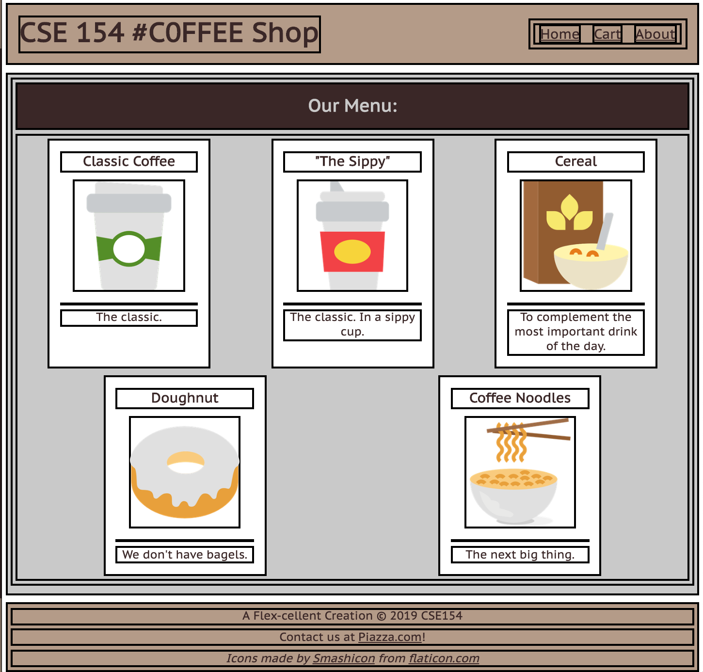
body(column with 3 children)#item-container(row with 5 children)#top-barheader (row with 2 children)
We'll take an "outside-in" approach, starting with the body
The Body Layout: A Column
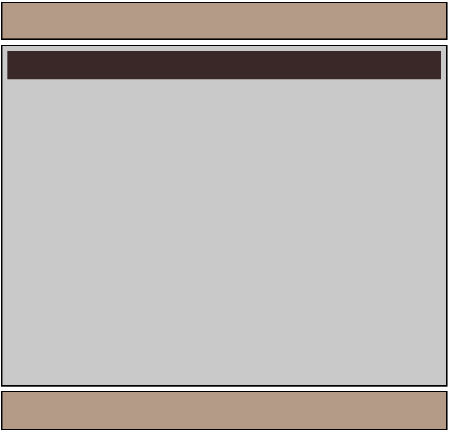
Demo
Figuring out the Flex Layout
For the body, we know we want a column.
We already get a column layout from the default block display
for header, main, footer.
But by default, these elements will have a height defined by their contents. This will result in whitespace at the bottom of the page.
We can use flex to control the distribution of the body's children to fill the entire page!
Making the Body a Flex Column
Many page layouts desire a full viewport height (vh) with a footer at the bottom.
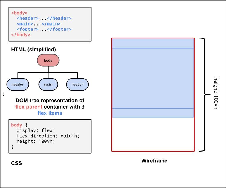
To set the body to be 100% of the view port height, use the vh size unit.
Using flex-grow with column page layout
Next, we can use flex-grow: 1 on the child element of the body flex container to have that child fill any remaining whitespace
(the default for flex-grow for all items is 0). Let's make the main child fill the rest of the whitespace of the parent.
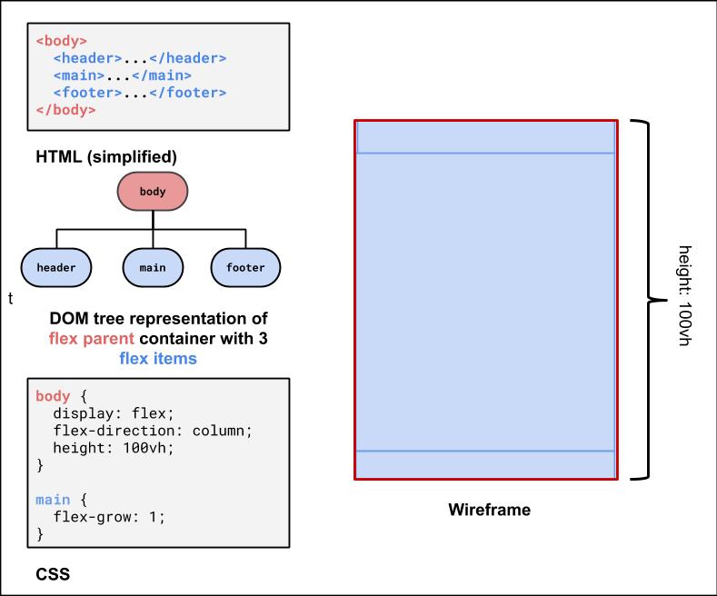
Second Flex Container: #item-container
This is the div that holds all of the product article "cards".
It would be nice to have some control over their distribution, and wrap them when the screen gets smaller.
<div id="item-container">
  <article>...</article>
  <article>...</article>
  <article>...</article>
  <article>...</article>
  <article>...</article>
</div>
HTML
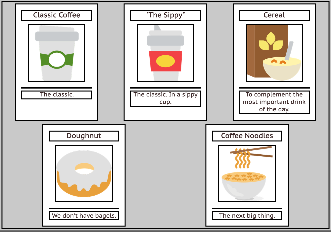
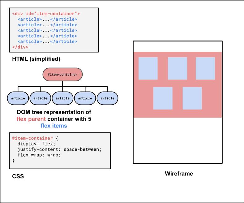
What's type of flex container is #item-container? (Demo)
#item-container Solution
Third Flex Container: The #top-bar
<header id="top-bar">
  <h1>...</h1>
  <nav>...</nav>
</header>
HTML
This is a bit of a trickier one, so it's good to do it last. We want to make it a flex row
so we can get a nice distribution of space between the h1 and the nav.
We'll also make the #top-bar a sticky nav bar, so it sticks to the top when you scroll down!
With careful planning, we can combine different layout techniques like display: flex; and position: sticky.
Next week, we'll look more closely at the position property.
