CS 132
Week 2 Extra Practice (CSS)
GOT Selectors
Directions: Use the given HTML code and CSS selector tool on the slide below to improve your skills in CSS selectors!
Hint: combinators from Tuesday's lecture will be useful here!
<!DOCTYPE html>
<html>
  <head><title>GOT FTW</title></head>
  <body>
  <h1>Game of Thrones Page</h1>
  <div id="intro">
    <h2>Introduction</h2>
    <p>Game of Thrones is the best series ever!</p>
  </div>
  <div id="content">
    <div class="bordered">
      <p>
        There are five books: A Game of Thrones, A Clash of Kings, a Storm of Swords, a Feast for Crows, and a Dance with Dragons.
      </p>
    </div>
    <h2>Houses</h2>
    <ul>
      <li>House Stark</li>
      <li>House Targaryen</li>
      <li>House Lannister</li>
      <li>House Tully</li>
    </ul>
    <h2>Plot</h2>
    <p>It's too long to describe. Just read the books!</p>
  </div>
  <div id="footer">
    <h2 class="bordered">Thank you!</h2>
  </div>
  </body>
</html>
HTML
Write a CSS selector here for:
- all
h2elements - element with ID
intro h2elements insideintroh2elements insidecontentandfooterpelements insidecontentpelements directly insidecontent- elements with class
bordered h2elements with classbordered
GOT Selectors: Solutions
- all
h2elementsh2 - element with ID
intro#intro h2elements insideintro#intro h2h2elements insidecontent, footer#content h2, #footer h2pelements insidecontent#content ppelements directly insidecontent#content > p- elements with class
bordered.bordered h2elements with classborderedh2.bordered
(HTML and CSS): CSS Stands For...?
Given the following HTML, what HTML and CSS would be necessary to produce the expected output below? (You can download the HTML here).
<h1>CSS: Corgis, Short & Sweet</h1>HTML
                    CSS: Corgis,
                    Short &
                    Sweet
output
- The "CSS" text is green, underlined and 40pt font.
- Both "Short" and "Sweet" have a cursive font type.
-
Any text that is not green/purple has a color of
#444. - The "short" text is all lower-case and has a font-size of 14pt.
- The "Sweet" text is purple and italicized.
Note: you may add
<span> tags as appropriate to get the desired
output.
Solution
CSS: Corgis,
Short &
Sweet
HTML
h1 {
  color: #444;
}

#css-abbr {
  color: green;
  font-size: 40pt;
  text-decoration: underline;
}

#short, #sweet {
  font-family: cursive;
}

#short {
  font-size: 14pt;
  text-transform: lowercase;
}

#sweet {
  color: purple;
  font-style: italic;
}
CSS
Exercise: Boxes
Given boxes.html, write
boxes.css to make the appearance below.
Note: Inspect/view page source on boxes.html to see the HTML code!
output
More details for this exercise are on the slide below (Hint: There is more than one possible solution!)
Expected Output Details
The outer padding of the box is teal with a width of 50 pixels.
The inner border of the box is pink with a width of 50 pixels.
The inner background color of the box is salmon with a width and height of 200 pixels.
The overall box has a total width and height of 400 pixels.
Flex Layout Review: The Flex Axis

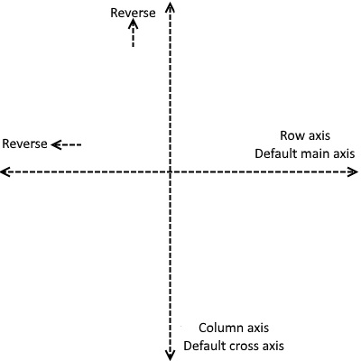
Key to flex layout is the idea of a main axis and a cross axis.
The main axis, (row-oriented by default), defines the direction that elements are laid out in the container. The cross axis (column-oriented by default), is simply whatever direction is perpendicular to the main axis.
Spacing on elements is defined in the main axis with justify-content
and within the cross axis with align-items and
align-content.
Common Flex Properties
| Property | Description | Values (Defaults in italics) |
|---|---|---|
justify-content |
Defines how to space flex items within the main axis | flex-start, flex-end, center, space-between, space-around, space-evenly |
align-items |
Defines how to space flex items within the cross axis rows/columns | stretch, flex-start, flex-end, center, baseline |
align-content |
Defines how to space main axis rows/columns on the cross axis | stretch, flex-start, flex-end, center, space-between, space-around, space-evenly |
flex-direction |
Defines the direction of the main axis | row, row-reverse, column, column-reverse |
flex-wrap |
Defines whether or not to wrap, and in what direction | nowrap, wrap, wrap-reverse |
flex-flow |
Set direction and wrap simultaneously | Set two values, one from wrap, one from direction |
Dominos!
Write the CSS necessary to recreate the expected appearance below:
Each of the two squares has a width and height of 100px and a 3px solid black border.
Each dot has a diameter (width) of 20px.
Use CSS flex properties to layout the boxes as shown (starting HTML is below).
Provided HTML
<div id="domino">
    <div class="square">
        <div class="dot"></div>
    </div>
    <div class="square">
        <div class="square-col">
            <div class="dot"></div>
            <div class="dot"></div>
            <div class="dot"></div>
        </div>
        <div class="square-col">
            <div class="dot"></div>
            <div class="dot"></div>
            <div class="dot"></div>
        </div>
    </div>
</div>
HTML
More Dominos!
Write the CSS necessary to recreate the expected appearance below:
<div id="domino">
    <div class="square">
        <div class="square-col">
            <div class="dot"></div>
        </div>
        <div class="square-col">
            <div class="dot"></div>
        </div>
    </div>
    <div class="square">
        <div class="square-col">
            <div class="dot"></div>
            <div class="dot"></div>
        </div>
        <div class="square-col">
            <div class="dot"></div>
            <div class="dot"></div>
        </div>
    </div>
</div>
HTML
Tetriminos! L-Block 1
Each of the four "boxes" has a width and height of 80px and a 4px solid black border (as part of the 80px width/height).
Each box has a border radius of 2px.
Each box has a background color of #6df15d.
Use CSS flex properties to layout the boxes as shown. Starter HTML is provided here.
Tetriminos: L-Block 2
Using the same styling as the previous exercise but with this HTML, write CSS to achieve the following output:
For an added challenge, try achieving the layout above using the same HTML as the previous example (it is possible!)
CSS Art
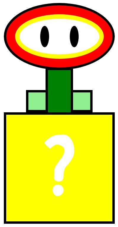
A fun way to practice CSS is to make art with it! Using only div elements and simple rules, we will create this image.

You can find the starter code here. You can either download the HTML and CSS files to edit locally, or edit the code in your Inspector to see the results live as you code.
To code in the Inspector, go to the sources tab and select the CSS file. Note that changes made there are not saved locally, so you have to copy and paste the modified code into a file if you want to save it.
Use the image on the previous slide and the guiding comments to implement the CSS art.
Tip: Do not do the eye spacing until the end - what different flex properties will help you achieve the expected output? What are the parent containers? Take care not to over-flex!
Challenge: Add a Tasteful Background image
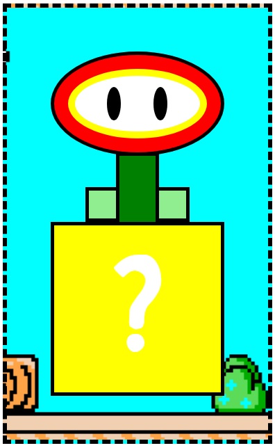
Let's add additional styles to the container to surround our flower with a Mario-themed background.

Requirements
- Surround the container with a 5px wide black dashed border.
- Add 50px of space between the flower and the edges of the container.
- Add mario.png as a background.
- Make the background image cover the container so that the height of the image is the same as the height of the entire container.
- Move the background image 480px to the left.